Best Fonts for Flyers: Pairings That Actually Get Read
Introduction: Why Typography Determines Flyer Success
When a potential customer walks past a community bulletin board, picks up a door hanger, or receives a promotional handout, you have less than 3 seconds to capture their attention. While vibrant colors and compelling imagery draw the initial eye, typography does the heavy lifting of communicating your core offer, event date, location, pricing, and call to action.
Using decorative or hard-to-read script fonts for essential event details, pairing conflicting typefaces, or ignoring typographic hierarchy are the fastest ways to kill foot traffic and lower conversion rates. Conversely, strategic font choices establish immediate brand authority, guide the reader's eye effortlessly down the page, and drive immediate action.
In this deep-dive guide, we break down typographic hierarchy principles for print, showcase 10 high-converting Google Fonts pairings, detail technical print rules (point sizes, leading, tracking), present 15+ AI prompts for typography styling, compare font categories, and demonstrate how to generate perfectly typed flyers in 30 seconds with FlyerEase.
Mastering print typography ensures that whether you are designing a high-impact corporate service flyer or a casual neighborhood yard sale poster, your message cuts through local visual noise and reaches your target audience clearly.
1. The 4 Layers of Print Typographic Hierarchy
Effective print layout design relies on a structured visual hierarchy. Readers scan printed flyers in a predictable top-to-bottom pattern. Establishing 4 distinct font levels ensures your message is processed instantly without cognitive fatigue:
- Level 1: The Main Headline (24pt - 48pt+): The primary focal point. Must be bold, high-contrast, and legible from 10 feet away (e.g., "GRAND OPENING", "COMMUNITY GARAGE SALE", or "50% OFF SUMMER CLEARANCE").
- Level 2: The Subheader & Value Proposition (14pt - 20pt): Expands on the headline hook, providing vital context or key dates (e.g., "Join Us Saturday July 26th for Free Live Music & Catering").
- Level 3: Body Copy & Details (10pt - 12pt): Bulleted lists of services, schedules, address directions, pricing tiers, or speaker bios. Kept clean and uncluttered.
- Level 4: Contact & Call to Action Footer (10pt - 14pt Bold): Prominent phone number, website URL, social media handles, or scannable QR code for immediate conversion.
Ensuring distinct size and weight contrast between each level prevents visual flatness and helps prospective customers extract crucial information at a glance.
When typography hierarchy is executed correctly, readers absorb your primary marketing message in under 2 seconds, allowing them to instantly decide whether to attend your event or call your business for services.
2. 10 High-Converting Google Fonts Pairings for Flyers
Pairing fonts correctly requires balancing visual contrast, stroke weight, letter proportions, and emotional tone. Here are 10 battle-tested font combinations with direct links to download them free on Google Fonts:
1. Montserrat (Headline) + Open Sans (Body)
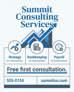
Best For:Corporate business services, real estate agency flyers, and professional consulting. Montserrat's geometric sans-serif structure delivers modern architectural authority, while Open Sans provides neutral, effortless body copy legibility across all printed paper weights.
Using Montserrat in Extra-Bold (800 weight) for headlines paired with Open Sans Regular (400 weight) creates an unbeatable high-contrast corporate aesthetic that builds immediate client trust.
2. Playfair Display (Headline) + Source Sans 3 (Body)
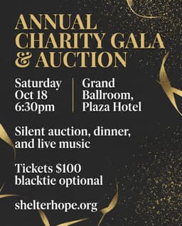
Best For: Luxury spa services, upscale real estate listings, charity fundraising galas, and wedding event flyers. Playfair Display offers high-contrast serif elegance with editorial sophistication, perfectly balanced by the clean utility and neutral tone of Source Sans 3.
3. Bebas Neue (Headline) + Roboto (Body)
Best For:Fitness gym promotions, sports tournaments, concert flyers, and flash retail sales. Bebas Neue's condensed all-caps display lettering creates maximum vertical punch from passing cars and sidewalk traffic, while Roboto delivers highly readable paragraph details.
4. Oswald (Headline) + Lato (Body)
Best For:Food truck events, craft beer festivals, and community block parties. Oswald provides bold condensed presence, balanced by Lato's warm, approachable semi-rounded letterforms that convey friendly community warmth.
5. Merriweather (Headline) + Open Sans (Body)
Best For: Academic lectures, church Easter services, law firms, and educational tutoring. Merriweather is a highly readable serif specifically engineered for crisp print clarity and academic authority.
6. League Spartan (Headline) + Montserrat (Body)
Best For: Modern tech workshops, startup networking events, and fashion pop-up sales. League Spartan offers ultra-bold geometric punch that demands instant attention from passersby.
7. Raleway (Headline) + Merriweather Light (Body)
Best For:Art gallery exhibitions, boutique cafes, and interior design showcases. Raleway's stylish thin-and-bold weight variants create artistic sophistication and high fashion flair.
8. Poppins (Headline) + Inter (Body)
Best For: SaaS software events, digital agency flyers, and healthcare announcements. Poppins offers friendly geometric curves, while Inter provides computer-screen-to-print perfection.
9. Cinzel (Headline) + Cormorant Garamond (Body)
Best For: Wine tasting events, classical music concerts, and historical museum exhibits. Cinzel brings Roman inscription dignity, pairing beautifully with Cormorant Garamond.
10. Archivo Black (Headline) + Work Sans (Body)
Best For: Handyman services, auto detailing, construction hiring, and yard sales. Heavy weight guarantees outdoor readability from passing cars and street bulletin boards.
3. Technical Typography Print Rules: Point Sizes & Spacing
Typography that looks clear on a bright backlit laptop screen can easily fail when printed on paper. Follow these technical print specifications:
1. Minimum Point Sizes for Print
- Main Headline: 24pt to 48pt+ (depending on flyer paper size).
- Subheaders: 14pt to 18pt.
- Body Copy: 10pt to 12pt (never drop below 8pt for legibility).
- Disclaimers & Fine Print: 8pt minimum on high-contrast backgrounds.
2. Line Spacing (Leading) & Letter Spacing (Tracking)
Set line spacing (leading) to 120% - 130% of font point size (e.g., 14pt leading for 12pt body text) to prevent crowded lines. Increase letter spacing (tracking) slightly on all-caps display headers for enhanced legibility.
Additionally, keep line lengths between 45 and 75 characters per line. Lines that are too wide tire the reader's eyes, while lines that are too short break text flow awkwardly.
When using reverse text (white or light colored lettering over a dark solid background), increase font weight by one step and expand letter tracking by 5% to 10% to prevent ink bleed on porous newsprint or cardstock.
4. 15+ Typography-Focused AI Flyer Prompts
Use these prompts in FlyerEase to generate flyers with strong typographic hierarchy, high-contrast headline styling, and clean body text layout:
1. Corporate & Professional Prompts
- Idea 1: Modern Corporate Service Flyer: Bold Montserrat headline 'PROFESSIONAL ACCOUNTING SERVICES', clean Open Sans body text, navy blue and white grid layout, 300 DPI vector PDF output.
- Prompt: "Corporate business flyer layout, bold sans-serif headline typography, structured Montserrat title, clean Open Sans body text, navy blue accent bars, high contrast legibility, 300 DPI vector print."
- Idea 2: Luxury Real Estate Showcase: Elegant Playfair Display serif title, gold foil accents, charcoal background, high-end editorial font spacing.
- Idea 3: Financial Advisory Seminar: Authoritative Merriweather serif title paired with clean sans-serif agenda list and high-contrast date badges.
2. Event & Retail Prompts
- Idea 4: Ultra-Bold Fitness Gym Pass: Condensed Bebas Neue headline 'SUMMER BOOTCAMP', high-energy red and black typography, extreme vertical contrast.
- Idea 5: Warm Food Truck Festival: Friendly Oswald title, warm orange palette, clear pricing menu layout with bold price badges.
- Idea 6: High-Tech Startup Conference: Modern Poppins and Inter font pairing, neon gradient accents on dark slate background.
3. Specialized Typography Prompts
- Idea 7: Vintage Barber Shop Menu: Classic retro typography, brass accent lines, clear rate list with vintage serif fonts.
- Idea 8: Community Easter Egg Hunt: Friendly rounded typography, pastel spring palette, clear event schedule and location directions.
- Idea 9: Handyman Service Door Hanger: Ultra-heavy Archivo Black headline readable from street view with bold bullet points.
- Idea 10: Classical Music Concert Poster: Elegant Cinzel Roman serif header, dark emerald background, high-contrast event venue text.
- Idea 11: Youth Summer Camp Flyer: Playful energetic display fonts, vibrant colors, clear age eligibility details and counselor badges.
- Idea 12: Boutique Fashion Sale Card: Minimalist Raleway thin header, high-contrast black and white editorial layout with bold sale discount numbers.
- Idea 13: Nightclub DJ Event Poster: Glowing neon script headline, dark background, bold date badges and scannable VIP QR code.
- Idea 14: Farmers Market Organic Produce Poster: Natural serif typography, green leaf vector accents, clean vendor pricing list.
- Idea 15: Garage Sale Directional Yard Sign: Ultra-large 72pt impact font with directional arrows for car visibility from 50 feet away.
Each prompt is engineered to instruct generative AI systems to enforce strong typographic contrast, ensuring that the visual hierarchy remains balanced and print-ready.
5. 5 Common Typography Mistakes to Avoid on Flyers
- 1. Using Fancy Script Fonts for Body Copy: Decorative script fonts (like Brush Script or Pacifico) become completely unreadable when rendered at small body sizes. Use script fonts exclusively for short 2-to-3 word headline accents.
- 2. Low Color Contrast Between Text & Background: Placing dark grey text over dark background images or light yellow text on white paper destroys readability. Maintain a minimum WCAG 4.5:1 contrast ratio for all body text.
- 3. Mixing More Than 3 Font Families: Using 4, 5, or 6 different font styles on a single flyer creates visual chaos, dilutes visual hierarchy, and distracts from your core marketing message.
- 4. Tiny Phone Numbers & Website URLs: Hiding your phone number, street address, or website in tiny 8pt font at the bottom corner lowers response rates. Make contact details bold and prominent.
- 5. Centering Long Paragraphs of Body Text: Centered body text forces the reader's eyes to find a new starting point for every line. Always left-align body copy paragraphs for effortless reading.
Avoiding these 5 typography mistakes guarantees your promotional flyer communicates clearly, presents a highly professional brand image, and converts casual readers into paying clients.
Always review a printed proof sheet from your desktop printer under natural lighting to verify that color contrast, font sizes, and line leading remain razor sharp before executing large commercial print orders.
6. Comparison: Font Categories for Print Flyers
Selecting the appropriate font category depends on your industry tone, target demographic, and physical placement location:
| Font Category | Visual Tone & Feeling | Best Placement | Print Caution |
|---|---|---|---|
| Sans-Serif | Modern, Clean, Authoritative | Headlines, Body Text & CTAs | Avoid ultra-thin weights on dark backgrounds |
| Serif | Traditional, Elegant, Formal | Luxury Headlines & Editorial Body | Thin serifs can blur on low-quality paper |
| Condensed Display | High-Impact, Urgent, Powerful | Main Headlines & SALE Badges | Never use for multi-line body paragraphs |
| Decorative Script | Personal, Artistic, Playful | Short Headline Accents Only | Never use for body text or contact info |
Combining a high-impact Sans-Serif or Condensed Display header with a neutral Sans-Serif or Serif body typeface provides the ideal balance between eye-catching visual energy and effortless readability for high-converting marketing campaigns.
7. Let FlyerEase Handle Your Typography Automatically in 30 Seconds
Selecting harmonized font pairings, adjusting line leading, setting tracking, and ensuring proper point size contrast requires design training and time-consuming trial-and-error. FlyerEase handles typographic styling automatically using specialized generative AI.
Simply enter your event details or business information into our mobile tool, and AI pairs high-converting Google Fonts, applies perfect visual hierarchy, and exports a print-ready 300 DPI vector PDF in 30 seconds.
Whether you need an authoritative corporate business flyer, an elegant charity gala invitation, or an urgent roadside yard sale poster, FlyerEase delivers press perfection with zero design effort.
By combining automated vector typography rendering, 300 DPI high-resolution output, and smart color palette generation, FlyerEase ensures that your printed marketing materials stand out with professional agency quality across every distribution channel.
Generate your beautifully typed flyer today with FlyerEase and turn casual readers into active clients with effortless AI precision.
Frequently Asked Questions
What is the best overall font for flyer headlines?
Bold, highly structured sans-serif display fonts like Montserrat, Bebas Neue, Oswald, and League Spartan are widely considered the best fonts for flyer headlines. Their thick stroke widths and clean geometry ensure maximum visibility and instant readability from 5 to 10 feet away.
How many different fonts should you use on a single flyer?
Stick to maximum 2 or 3 font families per flyer. A classic formula uses 1 bold display or serif font for headlines, 1 clean sans-serif font for body details, and an optional stylized accent font for price badges or callouts. Using more than 3 fonts creates visual clutter and reduces conversion.
What is the minimum font size for readable flyer body copy?
The recommended minimum font size for printed flyer body text is 10pt (never smaller than 8pt). Headlines should be 24pt to 48pt+, and subheaders should range from 14pt to 18pt to ensure distinct visual hierarchy.
Are free Google Fonts suitable for commercial print flyers?
Yes. All Google Fonts available on Google Fonts (https://fonts.google.com/) are open-source and licensed for commercial print and digital use under SIL Open Font License or Apache License.
How does FlyerEase select font pairings automatically?
FlyerEase utilizes trained generative AI design systems that analyze your flyer subject, industry tone, and target audience, automatically pairing high-contrast, professional typography layouts in vector 300 DPI PDF output.
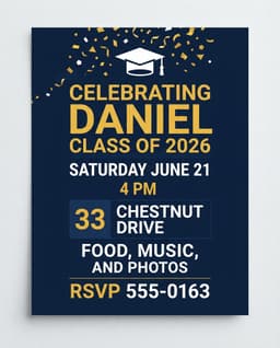
- 1Type your event details & promotional headline
- 2AI formats professional font hierarchy
- 3Print via AirPrint or download PDF for $3.99