How to Design a Flyer People Notice, Understand, and Act On
A flyer has only a few seconds to earn someone's attention. Whether it appears in a store window, on a community noticeboard, inside a mailbox, or in a social feed, people usually see it while doing something else. A successful flyer must communicate its value before the reader decides to move on.
That is why flyer design still matters in a digital-first world. A physical flyer can reach people in a specific neighborhood or at the exact place where a decision happens. The same design can also work as a downloadable handout, email attachment, or social post. Unlike an online advertisement, a printed flyer can remain visible for days or be passed from one person to another.
This guide is for business owners, event organizers, real estate agents, nonprofits, community groups, and anyone who needs to promote something without becoming a professional designer. It focuses on the principles that make a flyer easier to notice, understand, remember, and act on.
You will learn how to establish visual hierarchy, choose readable type and colors, organize essential information, create an effective printed call to action, avoid common production mistakes, and adapt your design to different types of flyers.
The core design principles behind an effective flyer
How do you create a clear visual hierarchy on a flyer?
A clear visual hierarchy tells the reader what to look at first, second, and third. The headline should be the most visually prominent element, followed by the main benefit or offer, essential details, and the call to action.
Hierarchy can be created through:
- Size
- Font weight
- Color
- Contrast
- Position
- Spacing
- Alignment
Start by deciding what someone must understand after looking at the flyer for two seconds. That message should receive the strongest visual emphasis. If the flyer promotes a summer concert, the event name or central promise should dominate. The organizer's logo, sponsor list, and full description should not compete with it.
A useful test is to blur your eyes or view the flyer as a small thumbnail. You should still be able to identify its headline, major visual, and call to action. If every element appears equally important, the design has no meaningful hierarchy.
Use three clear information levels: one dominant headline, one supporting layer, and one smaller detail layer. Adding more levels often makes a one-page flyer feel fragmented.
How much contrast does a flyer need?
A flyer needs enough contrast for its important information to remain legible in imperfect conditions, including dim lighting, quick glances, inexpensive printing, and viewing from several feet away.
Dark text on a light background and light text on a dark background are dependable combinations. Similar colors, such as pale gray on white or orange on red, may look attractive on a bright monitor but become difficult to read in print.
As a practical benchmark, aim for a contrast ratio of at least 4.5:1 for normal text and 3:1 for large text. These values come from the W3C's accessibility guidance. Although the standard was written for digital accessibility, it provides a useful baseline for flyer design too.
Do not place text directly over a detailed photograph unless the area behind it is consistently quiet. If you must use text over an image, add a solid panel, dark overlay, gradient, or subtle text background that creates reliable contrast across every letter.
Contrast should also establish importance. A bright accent color can highlight a discount, date, or call to action, but it loses its power if the same color is used everywhere.
Why does whitespace make a flyer more effective?
Whitespace separates information into understandable groups and prevents competing elements from overwhelming the reader. Every major section should have enough empty space around it to be recognized as a separate idea.
Whitespace does not have to be white. It can be any uncluttered area, including a solid color or a quiet part of a photograph.
Avoid filling every available corner simply because space remains. A flyer is not a storage container for everything you know about an event or business. Empty space around the headline makes it more prominent. Space between the event details and call to action helps readers understand that they serve different purposes.
Use spacing consistently. Related items, such as a date and time, should sit close together. Unrelated items should have more separation. This applies the basic principle of proximity: elements placed near one another are perceived as belonging together.
How many fonts should you use on a flyer?
Use no more than two typefaces per flyer, usually one expressive or bold face for headlines and one highly readable face for supporting text. A single typeface with several weights can work just as well.
The fonts should have different roles without fighting each other. A bold display face can create personality, while a neutral sans serif keeps practical information readable. If both fonts are decorative, the flyer may feel noisy. If they are extremely similar, the pairing may look accidental.
Keep these typography rules in mind:
- Reserve all caps for short headlines, labels, or calls to action.
- Avoid long paragraphs in script, condensed, or decorative fonts.
- Use bold weight for emphasis instead of changing fonts repeatedly.
- Keep body copy left-aligned unless the text is extremely short.
- Use comfortable line spacing so adjacent lines do not blend together.
- Avoid stretching, squeezing, or outlining fonts to force them into a space.
There is no single font size that works at every viewing distance. For a hand-held flyer, 16 to 20 pt is a safer starting range for important supporting text, while headlines may need to be 36 pt or larger. A wall-mounted flyer requires larger type because people encounter it from farther away.
Print one copy at actual size and test it where the flyer will appear. If the headline cannot be read from the expected approach distance, increase it. If the date, location, or price requires leaning in, increase those elements too.
How should you choose colors for a flyer?
Choose colors that match the event's tone, remain legible together, and help important information stand out. A restrained palette of two or three main colors is usually easier to control than a rainbow of competing accents.
Color can influence attention and interpretation, but it does not have one universal psychological meaning. Research reviewed by Elliot and Maier found that color can affect emotion, cognition, and behavior, while emphasizing that effects depend on context and learned associations. In other words, "red always means excitement" is too simplistic (source).
Use the audience, setting, and category as your guide:
- Festivals, parties, and youth events can support brighter, more energetic combinations.
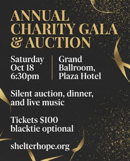
- Luxury services often benefit from restrained palettes, deep tones, and generous whitespace.
- Wellness events usually suit calm, low-saturation colors, provided the text still has strong contrast.
- Fundraisers can use warmer, human colors that support the emotional tone of the cause.
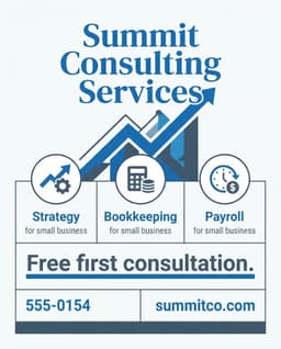
- Professional services should generally prioritize clarity, trust, and brand consistency.
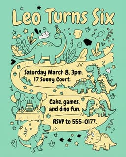
- Children's events can use playful color, but practical information still needs a quiet, readable area.
Choose one dominant color, one supporting color, and one accent. Use the accent sparingly for the offer, date, or action you most want people to notice.
What image quality does a printed flyer need?
Printed flyer images should generally have an effective resolution of about 300 pixels per inch at their final printed size. Adobe describes 300 PPI as a standard choice for high-quality print material.
A photograph can look sharp on a phone and still print poorly when enlarged. Check the pixel dimensions, not just the file size. An image that is 900 pixels wide can print at roughly three inches wide at 300 PPI. Stretching it across an 8.5-inch page will reduce its effective resolution significantly.
Use one strong image rather than several weak ones. The image should communicate something the text cannot convey as quickly: the atmosphere of an event, the appearance of a property, the product being offered, or the people helped by a fundraiser.
Avoid generic visuals that conflict with reality. If an event is informal and community-led, an image of a luxury gala may attract attention but set the wrong expectation.
What does a flyer that converts need to include?
What makes a flyer headline work?
A strong flyer headline communicates the main attraction or benefit in a few words. It should answer "Why should I care?" before it explains the details.
Compare "Annual Community Event" with "A Free Summer Movie Night for the Whole Family." The second version immediately communicates the format, cost, season, and audience.
Keep the headline specific and easy to repeat. Avoid clever wordplay that hides what is actually being promoted. If the event name is unfamiliar, pair it with an explanatory line.
How should you present the offer or hook?
The hook should give the reader a concrete reason to keep reading or take action. It may be a discount, useful outcome, exclusive experience, limited availability, or emotional benefit.
Examples include:
- 20% off your first visit
- Free admission for children under 12
- Tour the property before it reaches the open market
- Every ticket funds one week of school meals
- Learn three techniques you can use the same day
Make the offer precise. "Great deals available" is weaker than "Buy one lunch, get the second half price." If conditions apply, include them clearly without allowing fine print to dominate the design.
How should date, time, and location appear?
Date, time, and location should form one compact, easy-to-scan information block. A reader should not need to search different parts of the page to determine when and where something happens.
Write dates unambiguously. "Saturday, October 17" is clearer than "10/17" for an international audience. Include the year when the flyer may remain visible for a long time or when the event is promoted months in advance.
Use the venue's recognizable name and a complete address when necessary. Add practical information such as "free parking," "wheelchair accessible," or "online event" only if it can affect someone's decision to attend.
What makes a printed call to action effective?
A printed call to action must tell readers exactly what to do next and make that action possible without clicking. Use one primary action, pair it with a clear benefit, and provide a QR code, short URL, phone number, or physical destination.
"Learn more" is vague. Better calls to action include:
- Scan to reserve your free seat
- Call today for a same-week estimate
- Visit us before Sunday to claim 20% off
- Scan to view photos and book a tour
- Donate now to fund the next 100 meals
A QR code should have a short instruction beside it explaining what the reader will receive. Accessibility guidance from Carleton College also recommends using a mobile-friendly destination, avoiding multiple QR codes on one flyer, and testing the code before publishing.
Include a short written URL as a fallback when practical. Test the QR code from the actual printed proof, not only from your screen.
What contact information belongs on a flyer?
Include only the contact methods that support the desired next step. One phone number, email address, website, or social handle is usually enough.
If immediate contact is important, tell readers what the channel is for: "Text to book," "Email for accessibility requests," or "Call for a free estimate." Avoid filling the footer with every social network the organization has ever joined.
What common flyer design mistakes should you avoid?
Trying to say too much
Too much copy hides the most persuasive message. Reduce the content until a reader can understand the flyer's purpose, benefit, essential details, and next step in seconds.
Move background information, full schedules, menus, speaker biographies, or detailed terms to a landing page. The flyer should earn the next action, not answer every possible question.
Placing low-contrast text over a busy photo
Text over faces, foliage, buildings, or patterned clothing often becomes unreadable. Move the text to a quieter area or place it inside a high-contrast panel. Check every line, since one readable word does not make the full sentence readable.
Making every element large and bold
When everything demands attention, nothing controls attention. Choose one dominant headline, emphasize one offer, and use smaller type for supporting details.
Using fonts that cannot be read at the viewing distance
Thin scripts and compressed fonts may look stylish at full-screen zoom but fail on a printed noticeboard. Print at actual size and test the flyer from the distance at which people will first encounter it.
Forgetting a clear call to action
A phone number or QR code is not automatically a call to action. Explain what the reader should do and what happens afterward. "Scan to register in under two minutes" is more useful than an unexplained square code.
Ignoring bleed, trimming, and safe margins
Full-bleed artwork must extend beyond the final trim edge so minor cutting variation does not create white slivers. A common print bleed is 0.125 inch or 3 mm on every side, although your printer's specification should always take priority. Adobe identifies both measurements as standard examples.
Keep headlines, logos, contact information, and QR codes inside a safe margin, away from the trim line. Extend only backgrounds and intentionally edge-to-edge images into the bleed.
How should the design change for different types of flyers?
What makes an event flyer effective?
An event flyer should sell the experience first and organize logistics second. Lead with the event's identity, atmosphere, or central attraction, then group the date, time, venue, price, and registration details together.
Use an image that shows what attending will feel like. A food festival needs sensory appeal. A professional workshop needs a clear outcome. A live performance may benefit from the artist or performer as the dominant visual.
If capacity is limited, say so truthfully and place the registration call to action near the logistics block.
How should you design a business promotion flyer?
A business promotion flyer should focus on one offer for one audience. Lead with the customer benefit, show the product or result, state the terms clearly, and make redemption simple.
Include:
- A specific discount or benefit
- A relevant product, service, or outcome image
- A deadline when the offer genuinely expires
- A clear redemption instruction
- The business name and location
Consider adding a simple flyer-specific code or landing page so you can measure responses. Do not promote ten unrelated services with equal prominence.
What should a real estate open-house flyer include?
A real estate open-house flyer should help someone assess the property quickly and make visiting easy. Feature one strong exterior or interior image, the address, open-house date and time, price when appropriate, and three to five meaningful property highlights.
Useful highlights include square footage, bedroom and bathroom count, recent renovations, outdoor space, parking, and proximity to recognizable amenities. Avoid vague phrases such as "must see" when a concrete feature would be more persuasive.
Use a QR code for the full listing, map, photo gallery, or booking page. Keep the agent's name and contact details visible without letting personal branding overpower the property.
How do you design a fundraiser flyer that motivates action?
A fundraiser flyer should connect a specific need to a specific result. Explain what the contribution supports, who benefits, how to participate, and where the money goes.
"Help us make a difference" is broad. "A $25 donation provides a week of meals for one student" makes the outcome tangible, provided the organization can substantiate that claim.
Use authentic, permission-cleared imagery and a respectful tone. Include the organization's name, event details if relevant, donation method, and a concise trust signal such as registered nonprofit status or a link to financial information.
Frequently asked questions about flyer design
What size should an event flyer be?
US Letter at 8.5 x 11 inches is a versatile standard for handouts and noticeboards, while half-letter at 5.5 x 8.5 inches is more portable and 11 x 17 inches works better as a small poster. FedEx Office lists all three as available flyer formats.
Outside North America, A5 at 148 x 210 mm is common for handouts, A4 at 210 x 297 mm is a flexible general-purpose size, and A3 at 297 x 420 mm provides greater visibility for wall display. Choose the size based on viewing distance, distribution method, printer requirements, and the amount of essential information.
What font size is best for a printed flyer?
For a hand-held flyer, start around 16 to 20 pt for important supporting copy and 36 pt or larger for the main headline, then test a printed proof at actual size. Wall-mounted flyers need larger type because they must work from farther away.
There is no universal minimum because legibility also depends on the typeface, weight, contrast, lighting, and viewing distance. Dates, prices, addresses, and calls to action should never be treated as fine print.
Should a flyer be portrait or landscape?
Use portrait orientation for most handouts, counter displays, and noticeboards because it matches common paper formats and supports a natural top-to-bottom reading flow. Use landscape when the main image is wide, the flyer will appear on a horizontal screen, or the placement area specifically favors that shape.
The content and display environment should determine the orientation. Do not force a wide group photo or panoramic property image into a narrow portrait crop if it removes important information.
How much information should a flyer contain?
A flyer should contain enough information to explain the offer, identify who it is for, provide essential logistics, and enable one next action. Everything else can move to a website, registration page, product page, or conversation.
A practical editing test is to remove any sentence that does not increase interest, reduce uncertainty, or help the reader act.
Should a printed flyer include a QR code?
A printed flyer should include a QR code when the next step happens online, such as registration, booking, donating, viewing a listing, or claiming an offer. Label the code with the outcome, keep adequate clear space around it, link to a mobile-friendly page, and test it from a printed copy.
Use one QR code for one primary destination. Multiple codes force the reader to make an unnecessary decision and make the page harder to scan visually.
How can you tell whether a flyer design is working?
Measure an action connected specifically to the flyer, such as scans, visits to a unique short URL, registrations, calls, coupon redemptions, donations, or in-store visits. Decorative quality alone does not show whether the flyer achieved its purpose.
Before distribution, run a simple comprehension test. Show the design to someone for five seconds, hide it, and ask what was being promoted, when or where it happens, and what they should do next. Their answers will reveal whether the hierarchy is working.
Turn the principles into a finished flyer
An effective flyer is not the one with the most effects, colors, or information. It is the one that gives the right person a clear reason to stop, understand the offer, and take the next step.
If you want to apply these principles without building the layout manually, flyerease can turn a plain-English description of your event, business, or promotion into a complete flyer in about 30 seconds. Designing and previewing are free with no signup, so you can experiment with the message and visual direction before deciding whether to download the watermark-free, print-ready version for a one-time payment of $3.99.